Responsive Web Design

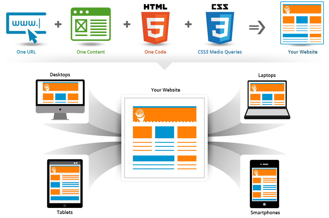
As the name suggests "Responsive" Web Design and Development, it is a technology to design and develop a website that can respond itself to any devices and screen resolutions. Now a day there are many devices/gadgets available in the market, and many more are expected to come in future and this will not end, so to develop a website for each and every devices is a cumbersome task or you can say it is next to impossible or at least "IMPRACTICAL", but if we not develop a website considering all the devices then we might start losing our visitors.

What is Responsive Web Design?

As mentioned above the current market trend have various devices with different screen size and resolutions, and one has to considered all this fact before designing a new website, the website has to be optimized so that it is compatible with different screen size and resolutions, otherwise all the hard work done on designing new site will fall back.

On a simple note the "Responsive Web Design is the process of developing a website in a way that the content laid out responds itself according to mobile devices screen size and resolutions".


Advantages of Responsive Web Design:

World Wide Web icon
Same URL for all Devices
Initially the separate web page was developed specific to devices, i.e. separate sites was developed for mobile and desktop, later on the dynamic approach was developed known as “Device Specific HTML Approach” so that website serve on same URL with different HTML and CSS depending on whether the user agent is a desktop or a mobile device. To overcome all this methods, a Responsive Web Design approach was developed so that your website will serve on Single URL to all the devices, whether it is smart phones, phablets, tablets, desktops etc.. This has benefited to users as well as search engines.
web design icon
One Content for all Devices
As the Separate Site for mobile and desktop OR device specific HTML site, the search engine will have to crawl multiple sites OR multiple pages for same site, Responsive Web Design approach overcome this issues , the search engine will have to crawl single URL and same content HTML, only the CSS3 media queries changes.
browsers icon
Wider Browser Support
Responsive Web Design (RWD) Approach uses “One HTML”, “One Content” and these are managed by CSS3 Media Queries which is now supported by most of the Browsers.
responsive icon
Futuristic Approach and Salable
It is because Responsive Web Design (RWD) responds itself according to various devices and screen sizes and not only this approach is compatible with current popular devices but for any future devices, it is consider as “Future Friendly Approach”. The mobile devices users count is increasing day by day the business will also grows, and it provides seamless user experience.
css 5
One HTML for all Devices
Instead of “Device Specific HTML Approach” where one has to code web page according to devices depending on user agents is a desktop or a mobile device, Responsive Web Design approach will have same/Single HTML code for all the devices
css 3
CSS3 Media Queries
Google recommends going with responsive web design approach, and this is where you use CSS3 media queries to change the way the web page laid out on mobile devices. This way your website will have “One URL”, ”One content”, “One HTML code” but CSS media queries to specify which CSS rules apply for the browser displaying the page. This will make easier for users to interact with the page and enable Search Engines(e.g. Google, Yahoo, Bing etc…) to assign the indexing properties to your content.
Internet icon
mproves Search Engine Optimization (SEO)
In Responsive Web Design(RWD) Approach, the URL, Content, HTML remains same for all the devices, making it easier to update and optimize the content at one place and it is also recommended approach by Search Engines(e.g. Google, Yahoo, Bing etc…), thus it improves Search Engine Optimization (SEO).
Rupees icon
Cost Effective
As the internet is growing rapidly with several devices coming in the market, makes it hard to create separate site cater specifically to mobile optimized site would be hard and expensive. Instead of maintaining 2 separate site for mobile and desktop, it would be wise to opt for Responsive Web Design(RWD) approach that will be highly optimized for search engines and very Cost Effective in comparison with maintaining 2 different site and future growth.
Open chat
1
Hello 👋
Can we help you?